35. Principal Component Analysis (PCA) in Python
By Tobias Schlagenhauf. Last modified: 17 Feb 2022.
Unsupervised Learning
Live Python training

Enjoying this page? We offer live Python training courses covering the content of this site.
See our Python training courses
What is Principal Component Analysis
When we perform Principal Component Analysis (PCA) we want to find the principal components of a dataset. Surprising isn't it? Well, what are the principal components of a dataset and why do we want to find them, and what do they tell us?

The principal components of a dataset are the "directions" in a dataset which hold the most variation (I assume that you have a basic understanding of the term variance. If not, look it up here. In simplified terms, the first principal component of a dataset is the direction along the dataset with the highest variation.
Consider the following dataset onto which I have drawn different "directions" shown by the differently colored arrows. What do you think, which arrow points into the direction with the largest variance of the dataset?
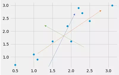
Well, by the naked eye we see that the orange arrow probably points into the direction with the largest variance.
Ok, but why do we need this direction(s)?
We want to have this direction (the direction with the largest variance) because in the future we want to use the principal components of the dataset to reduce dimensionality of our dataset the either make it "plottable" by reducing it to three or less dimensions, or simply to reduce the size of the dataset without loosing too much of the information. Reducing the dimensionality of our dataset is like creating new columns by combining columns such that the number of the new==combined columns is less than the original number of columns.
Imagine a dataset with only two columns A and B, then this dataset is said to be two dimensional. If we now combine these two columns to one column for instance by simply adding column one and two, the dataset is reduced to one dimension. To decide which columns should be combined and how we should combine them is kind of the goal of the PCA. Mind that this illustration is not 100% correct since the goal of the PCA is to transform the data and not simply cutting something off or combining something but for the first step this illustrations should to it.
That is, we want to decrease the size of our dataset to make life easier for the algorithms or to simply visualize the data by making it 2 or 3 dimensional.
But wait, I said decrease the size of the dataset, that is kind of "loosing something", correct? Correct! By reducing the dimensionality of a dataset we loose dimensions, that is, we loose information. Imagine a 3D movie where we remove the third dimension such that the remaining movie is two dimensional. We still can watch the film but we have lost some information. The question we have to find an answer to is: Which are the dimensions which held the most information of the dataset and which are the dimensions which held only little information - and therewith can be cut off without loosing too much information -.
Finding these dimensions (the principal components) and transforming the dataset to a lower dimensional dataset using these principal components is the task of the PCA. As said, in the end we use the found and chosen principal component to transform our dataset, that is, projecting our dataset (the projection is done with matrix multiplication) using these principal components. By doing this, we get a dataset with reduced dimensionality (that is reduced size) without loosing too much information -hopefully-.
Ok, to proceed and for the understanding we have to go a small step back. We want to find the principal components because these are the "directions" of the dataset with the highest variance. You ask yourself: Why highest variance? Well, it turns out that the directions with the highest variance (principal components) are the most informative directions. Let's make this clear using a little graphical illustration:
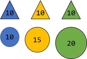
Since the values assigned to the triangles (let's assume the unit are kg) are all the same, the variance is 0 whereas the variance of the balls is $16.66 \ \ kg^{2}$
Now let's further assume someone chooses one ball and one triangle, tells you the assigned weight and wants you to make a prediction about the color. Whatever triangle the person chooses, the weight is always 10kg and therewith you have no chance to correctly predict the color of the triangle based on the kg number. Though, the weights of the balls differ (they have a higher variance as the triangles) and whatever weight the person will tell you, you can predict the color based on the number. To make this even more clear, assume in the next step the person wants you to do the same thing but now he or she does not tell you the exact number but only a number which is close to one of the above. For instance, 11kg.
Based on this number you can predict the color of the ball as blue since 11 is closer to 10 than to 15. Hence, the farther away the assigned weights are, that is, the higher the variance is, the easier it is for you to predict the color. Please take the above as a principal idea why we can use the variance as a measure of informativeness and do not claim a 100% mathematical correctness.
Ok, now we have understood why we want to have the directions with the highest variance (principal components). But on our way the main question is still unanswered. *How do we get these principal components?* We get these principal components by finding the directions with the highest variance.
Wise guy... we already know this. This sentence contains two important words: directions and variance - Finding the *direction* with the highest *variance* -. Well, we can do exactly the same as I have done above and simply draw an arbitrary line into the dataset. To know how good or bad this line is, we have to measure the variance of the data along this line. Now we know that the formula for the variance (of the population) is:
$$var(x)= \frac{\sum_{i=1}^n (x_i-\bar{x})^2}{n}$$
But here x is one dimensional and our dataset has two dimensions x and y, hence: Which of them should we use as $x$ in the variance calculation? Should we calculate the variance of x or y? The answer is: None of them is correct. Why? Look at the following illustration:
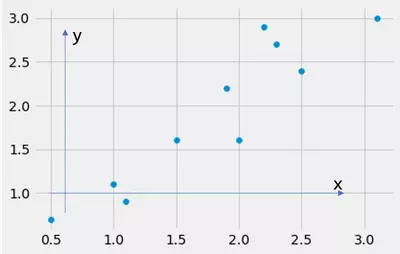
In this picture, I have drawn two arrows, one points into the direction of the x axis and one into the direction of the y axis. What happens if I calculate the variance along these arrows? Well, I calculate the variance along the feature x and along the feature y. The dataset looks like:
import pandas as pd
import matplotlib.pyplot as plt
from matplotlib import style
style.use("fivethirtyeight")
import numpy as np


data = np.array([[2.5,0.5,2.2,1.9,3.1,2.3,2,1,1.5,1.1],[2.4,0.7,2.9,2.2,3.0,2.7,1.6,1.1,1.6,0.9]])
print(data)
fig = plt.figure()
ax0 = fig.add_subplot(111)

ax0.scatter(data[0],data[1])

plt.show()
OUTPUT:

where the fist list represents the x feature and the second list represents the y feature. Consider the code below. What happens if we calculate the variance of the dataset along the *x-arrow* and along the *y-arrow*? We calculate the variance along the feature x and y! We implicitly do this by ignoring the other dimension (feature) x or y respectively. That is, by ignoring x or y, we kind of project the data onto the x or y axis and therewith reduce the dimensionality, that is cut one dimension off.
import pandas as pd
import matplotlib.pyplot as plt
from matplotlib import style
style.use("fivethirtyeight")
import numpy as np


data = np.array([[2.5,0.5,2.2,1.9,3.1,2.3,2,1,1.5,1.1],[2.4,0.7,2.9,2.2,3.0,2.7,1.6,1.1,1.6,0.9]])
print(data)
fig = plt.figure()
ax0 = fig.add_subplot(111)

ax0.scatter(data[0],data[1])
ax0.scatter(data[0],np.ones_like(data[1])*min(data[1])-0.2,color="red")
ax0.scatter(np.ones_like(data[0])*min(data[0])-0.2,data[1],color="blue")
ax0.arrow(min(data[0])-0.2,min(data[1])-0.2,0,max(data[1])-0.5,width=0.01,color="blue",alpha=0.4,length_includes_head="True")
ax0.arrow(min(data[0])-0.2,min(data[1])-0.2,max(data[0])-0.3,0,width=0.01,color="red",alpha=0.4,length_includes_head="True")
ax0.vlines(data[0],min(data[1])-0.2,data[1],colors="red",linestyles="--",linewidth=0.7)
ax0.hlines(data[1],min(data[0])-0.2,data[0],colors="blue",linestyles="--",linewidth=0.7)


plt.show()
OUTPUT:

Now you can see the effect of choosing the x and y axis as our principal components. We project the data onto the x and y axis. We can now calculate the variance of the projected data and see how good or bad we are. If you are confused how we can accomplish this transformation, keep calm, we come back to this later.
So now we have chosen the x and the y axis as our principal components. But as stated above, in that case this is most likely not correct because we have seen that the skewed (green) line from bottom left to top right is the line spanned by the vector which points into the direction of the highest variation == 1. principal component (at this point I have to mention that a dataset has as many principal components as it has dimensions but the first principal component is the "strongest"). So let's first of all assume, that this skewed green line is actually the first principal component of the dataset, that is, the vector which points into the direction of highest variation. How does this look like if we choose arbitrary vectors and do exactly the same thing as we have done taking the x and y direction as our assumed principal components (Mind that we want to project the data onto the line because we want to calculate the variation). Mind that since we now do actual calculations, we have to normalize the data to zero mean since otherwise the calculations fail.
We will now plot the dataset and choose arbitrary vectors whose values we can alter using sliders. We project the dataset onto the line spanned by the vector (defined by the slider values). We transform the dataset using the chosen vector and calculate the resulting variance. The point (the slider adjustment) which results in the largest variance gives us our first principal component. Additionally, we plot the "variance surface" with respect to the values we choose for the vector. So to summarize, by altering the direction of the line we want to find this line which leads to the highest variance when the dataset is projected onto this line. This line is the 1. principal component. If we choose lines parallel to the x and y axes, we simply cut off the other axis.
import numpy as np
import pandas as pd
from ipywidgets import interact,interactive,fixed,interact_manual
import matplotlib.pyplot as plt
from matplotlib import style
from mpl_toolkits.mplot3d import Axes3D
style.use('fivethirtyeight')


def f(x,y):

    data = np.array([[2.5,0.5,2.2,1.9,3.1,2.3,2,1,1.5,1.1],[2.4,0.7,2.9,2.2,3.0,2.7,1.6,1.1,1.6,0.9]])
    data[0] = data[0]-np.mean(data[0])
    data[1] = data[1]-np.mean(data[1])

    # Create Axes

    fig = plt.figure(figsize=(10,10))
    ax0 = fig.add_subplot(121)
    ax0.set_aspect('equal')
    ax0.set_ylim(-2,2)
    ax0.set_xlim(-2,2)
    ax0.set_title('Search for Principal component',fontsize=14)
    ax0.set_xlabel('PC x value',fontsize=10)
    ax0.set_ylabel('PC y value',fontsize=10)


    #vec = np.array([0.6778734,0.73517866])
    vec = np.array([x,y])

    ax0.scatter(data[0],data[1])
    ax0.plot(np.linspace(min(data[0]),max(data[0])),(vec[1]/vec[0])*np.linspace(min(data[0]),max(data[0])),linewidth=1.5,color="black",linestyle="--")


    b_on_vec_list = [[],[]]
    for i in range(len(data[0])):
        a = vec
        b = np.array([data[0][i],data[1][i]])
        b_on_a = (np.dot(a,b)/np.dot(a,a))*a
        b_on_vec_list[0].append(b_on_a[0])
        b_on_vec_list[1].append(b_on_a[1])
        ax0.scatter(b_on_a[0],b_on_a[1],color='red')
        ax0.plot([b_on_a[0],b[0]],[b_on_a[1],b[1]],"r--",linewidth=1)


    ax1 = fig.add_subplot(122,projection='3d')
    ax1.set_aspect('equal')
    ax1.set_ylim(0,1)
    ax1.set_xlim(0,1)
    ax1.set_title('Varicane with respect to the 1. PC',fontsize=14)
    ax1.set_xlabel('PC x value',fontsize=10)
    ax1.set_ylabel('PC y value',fontsize=10)
    ax1.set_zlabel('variance',fontsize=10)


    # Transform data
    e_vec = (1/np.sqrt(np.dot(vec,vec.T)))*vec
    data_trans = np.dot(data.T,e_vec)

    # Plot the data
    ax0.scatter(data_trans,np.zeros_like(data_trans),c='None',edgecolor='black')
    # Plot the twisted line
    ax0.plot(np.linspace(min(data_trans),max(data_trans),10),np.zeros_like(data_trans),linestyle='--',color='grey',linewidth=1.5)
    # Plot the circles
    for i in range(len(data_trans)):
        ax0.add_artist(plt.Circle((0,0),data_trans[i],linewidth=0.5,linestyle='dashed',color='grey',fill=False))

    # Calculate the variance
    ax0.text(0,-1.4,'variance= {0}'.format(str(np.round(np.var(data_trans),3))),fontsize=20)


    # Plot the variance with respect to the principal component vector

    # Initialize the meshgrid
    cross_x,cross_y =np.meshgrid(np.linspace(0.001,1,num=20),np.linspace(0.001,1,num=20))
    # Create the iterators in the format [(0.01,0.01),(0.01,0.0620),(0.01,0.114),...(0.0620,0.01),(0.0620,0.0620),(0.0620,0.1141),...(0.999,0.01),(0.999,0.0620),...(0.999,0.999)]
    x_y_pairs = []
    for i in range(len(cross_y)):
        x_y_pairs.append(list(zip(cross_x[i],cross_y[i])))
    flatten_x_y_pairs = [np.array(list(x_y)) for sublist in x_y_pairs for x_y in sublist]


    variances = []
    for i in flatten_x_y_pairs:
        e_vec = (1/np.sqrt(np.dot(i,i.T)))*i
        data_trans = np.dot(data.T,e_vec.T)
        variances.append(np.var(data_trans))


    index_of_max_variance = np.where(variances == max(variances))[0][0]
    # PLot the variance surface
    ax1.scatter(cross_x,cross_y,np.array(variances).reshape(20,20),alpha=0.8)


    # Mark the point with the highest variance
    vec_point = np.array([x,y])
    e_vec_point = (1/np.sqrt(np.dot(vec_point,vec_point.T)))*vec_point
    data_trans_point = np.dot(data.T,e_vec_point.T)
    ax1.scatter(x,y,np.var(data_trans_point)+0.01,color="orange",s=100)


    plt.show()


interact(f,x=(0.001,1,0.001),y=(0.001,1,0.001))
OUTPUT:

By playing around with the sliders we can see that slider values of [0.67,0.73] lead to the highest variance. Mind also the gray dashed circles as well as the gray scatter dots on the x axis. If we project the dataset onto the line spanned by the chosen vector and kind of twist around this line such that it aligns with our original x axis, we make the spanned line our new x axis. While altering the vector values we can now observe the spread of these values on the x axis, the more spread out the values are, the higher the variance. This projecting of the dataset and twisting of the spanned line is accomplished by transforming the original dataset using the chosen vector.
But wait, you said projected and transformed... How can we project data? Well, therefore you must be familiar with linear algebra. If you are, fine. If not, this youtube playlist about the essence of linear algebra might be very useful. So what we are doing is simply calculating the *dot product* (sometimes it is also called scalar product) of our dataset and the chosen vector. So now for simplicity, assume we use an arbitrary dataset and want to project this dataset onto the y axis. To project the dataset we need two things. First, the dataset of shape $nxn$ and a vector of shape $nxm$. We know that after calculating the dot product, the resulting dataset has the dimensionality $nxm$ and hence if $m < n$, we have reduced the dimensionality of our original dataset. Now lets turn this into practice.
Assume we have a $10x2$ dataset and we want to project this dataset onto the line spanned by the vector pointing into the direction of the y axis (This is the same as we have done above). This vector is the unit vector [0,1] which has dimensionality $1x2$. What we want to have is the dataset projected onto the y axis and therewith a dataset with the dimensionality $10x1$. So to accomplish that, we have to calculate the dot product of:
$data*vec^{T}$ where $vec^{T}$ is the transposed unit vector and therewith has no longer the shape $1x2$ but $2x1$ and therewith the resulting dataset has the shape $10x1$. If we now do the described calculations in practice, this looks like:
import numpy as np
data = np.array([[2.5,0.5,2.2,1.9,3.1,2.3,2,1,1.5,1.1],[2.4,0.7,2.9,2.2,3.0,2.7,1.6,1.1,1.6,0.9]])
ex = np.array([[1,0]])
ey = np.array([[0,1]])

print(data.shape)
print(ex.shape)

print(np.dot(data.T,ey.T)) #  As you can see this is exactly the y component (x dimension) of our dataset
OUTPUT:
(2, 10)
(1, 2)
[[2.4]
 [0.7]
 [2.9]
 [2.2]
 [3. ]
 [2.7]
 [1.6]
 [1.1]
 [1.6]
 [0.9]]
As you can see, the result is the same as the y values of the original dataset. This is logical since by transforming the data onto the y axis (look at the plot above) we just omit the x values of the dataset. Now assume we do not use the vector [0,1] which is the unit vector pointing into the direction of the y axis but any other arbitrary vector like for instance [0.653,1.2] what happens? Well the calculation are exactly the same: we calculate the dot product of the 10x2 dataset with the 2x1 vector and get a dataset with dimensionality 10x1 projected onto this vector. Though, the line onto which we have projected the data is no longer a vertical line but a slant line with slope 1.2/0.653.
import matplotlib.pyplot as plt
from matplotlib import style
style.use('fivethirtyeight')
import numpy as np
import matplotlib.patches as patches

def f(lamb):

    # Unit vectors
    e_x = np.array([1,0])
    e_y = np.array([0,1])


    # Area spanned by the unit vectors
    print(np.cross(e_x,e_y)) # Area spanned by the unit vectors == 1


    # Any 2D matrix A of the shape (A-lambda*I)
    A = np.array([[2-lamb,3],[3,0.5-lamb]])


    # Transform the unit vectors by the matrix A --> Unsurprisingly this is exactly the matrix A but otherwise the notation
    # of "the determinant describes the change of the area spanned by the unit vectors after trasnformation" makes no sense

    # Plot the vectors
    fig = plt.figure(figsize=(10,10))
    ax0 = fig.add_subplot(111)
    ax0.set_xlim(-5,8)
    ax0.set_ylim(-5,8)
    ax0.set_aspect('equal')

    # Vector of matrix A
    ax0.arrow(0,0,A[0][0],A[0][1],color="red",linewidth=1,head_width=0.05) #First vector
    ax0.arrow(0,0,A[1][0],A[1][1],color="blue",linewidth=1,head_width=0.05) # Second vector


    # Area spanned by the vectors**
    ax0.arrow(A[0][0],A[0][1],A[1][0],A[1][1],color="blue",linestyle='dashed',alpha=0.3,linewidth=1,head_width=0.05)
    ax0.arrow(A[1][0],A[1][1],A[0][0],A[0][1],color="red",linestyle='dashed',alpha=0.3,linewidth=1,head_width=0.05)
    ax0.add_patch(patches.Polygon(xy=[[0,0],[A[0][0],A[0][1]],[A[0][0]+A[1][0],A[0][1]+A[1][1]],[A[1][0],A[1][1]]],fill=True,alpha=0.1,color='yellow'))

    # Add text which shows the calculation of the determinant and the area
    ax0.text(3,-0,s=r'$determinant = a_{11}*a_{22}-a_{21}*a_{12}$'+'= {0}'.format(np.round(A[0][0]*A[1][1]-A[1][0]*A[0][1],3)))
    #ax0.text(3,-1,s='area = {0}'.format(np.round(np.cross(A.T[0],A.T[1]),3)))
    ax0.text(3,-0.5,s=r'$determinant$'+'= {0}*{1}-{2}*{3} = {4}'.format(A[0][0],A[1][1],A[1][0],A[0][1],np.round(A[0][0]*A[1][1]-A[1][0]*A[0][1],3)))
    ax0.text(3,-4,s='**Mind that in this case the value of the determinant \n and the area(cross product --> Yellow shaded) are the same \n since the area spanned by the unit vectors is 1',fontsize=8)


    # Plot the eigenvectors
    ax0.arrow(0,0,0.61505,-0.788491,color="black",linestyle='dashed',alpha=0.3,linewidth=1,head_width=0.05)
    ax0.arrow(0,0,0.78771,0.6159,color="black",linestyle='dashed',alpha=0.3,linewidth=1,head_width=0.05)

    # Caclulate (A-lambda I)*nu for different values of lambda using the found eigenvectors. The result must be
    # 0 when nu is perpendicular to (A-lambda I)
    # Mind that for the calculation of v1 and v2 we have to solve the linear system of equations (A-lambda I)*v=0
    # for v1 and v2

    v1 = -3*(((-1+0.5*lamb)/(-9-2*lamb+lamb**2)))/(2-lamb)
    v2 = (-1+0.5*lamb)/(-9-2*lamb+lamb**2)
    v = np.array((1/np.sqrt(v1**2+v2**2))*np.array([v1,v2]))
    ax0.text(3,-1,s=r'$(A-$'+'{0}'.format(lamb)+r'$I)*\nu$'+'= {0}'.format(np.round(np.dot(A,v),3)))
    ax0.arrow(0,0,-v[0]*0.5,-v[1]*0.5,color="green",alpha=0.8,linewidth=1,head_width=0.05) # We draw the eigenvector for lambda
                                                                                        # Mind v[0]*0.5 and v[1]*0.5 --> The *0.5
                                                                                        # is solely done for visualization purposes


    plt.show()

interact(f,lamb=(-5,5,0.001))
OUTPUT:

Above we ran through steps 1 to 4, so the transformation of data using the eigenvectors is next.
$\underline{Reduce \ \ the \ \ dimensionality \ \ of \ \ the \ \ data \ \ - \ \ Putting \ \ all \ \ together}$
Once we have found the eigenvectors and eigenvalues of a dataset we can finally use these vectors (which are the principal components oft the dataset) to reduce the dimensionality of the data, that is to project the data onto the principal components.
So let's do this and while doing so run through all of the above steps to show how dimensionality reduction using the PCA can be accomplished with Python from scratch before we use the prepackaged sklearn PCA method. To illustrate this, we will use the UCI Iris dataset.
import numpy as np
from sklearn.preprocessing import StandardScaler
from sklearn.cross_validation import train_test_split
import matplotlib.pyplot as plt
from matplotlib import style
style.use('fivethirtyeight')
import pandas as pd


"""1. Collect the data"""

df = pd.read_table('data\Wine.txt',sep=',',names=['Alcohol','Malic_acid','Ash','Alcalinity of ash','Magnesium','Total phenols',
                                                 'Flavanoids','Nonflavanoid_phenols','Proanthocyanins','Color_intensity','Hue',
                                                 'OD280/OD315_of_diluted_wines','Proline'])

target = df.index


"""2. Normalize the data"""


df = StandardScaler().fit_transform(df)


"""3. Calculate the covariance matrix"""

COV = np.cov(df.T) # We have to transpose the data since the documentation of np.cov() sais
                   # Each row of `m` represents a variable, and each column a single
                   # observation of all those variables


"""4. Find the eigenvalues and eigenvectors of the covariance matrix"""

eigval,eigvec = np.linalg.eig(COV)
print(np.cumsum([i*(100/sum(eigval)) for i in eigval])) # As you can see, the first two principal components contain 55% of
                                                        # the total variation while the first 8 PC contain 90%


"""5. Use the principal components to transform the data - Reduce the dimensionality of the data"""

# The wine dataset is 13 dimensional and we want to reduce the dimensionality to 2 dimensions
# Therefore we use the two eigenvectors with the two largest eigenvalues and use this vectors
# to transform the original dataset.
# We want to have 2 Dimensions hence the resulting dataset should be a 178x2 matrix.
# The original dataset is a 178x13 matrix and hence the "principal component matrix" must be of
# shape 13*2 where the 2 columns contain the covariance eigenvectors with the two largest eigenvalues

PC = eigvec.T[0:2]


data_transformed = np.dot(df,PC.T) # We have to transpose PC because it is of the format 2x178


# Plot the data

fig = plt.figure(figsize=(10,10))
ax0 = fig.add_subplot(111)


ax0.scatter(data_transformed.T[0],data_transformed.T[1])
for l,c in zip((np.unique(target)),['red','green','blue']):
    ax0.scatter(data_transformed.T[0,target==l],data_transformed.T[1,target==l],c=c,label=l)

ax0.legend()


plt.show()
OUTPUT:
---------------------------------------------------------------------------
ModuleNotFoundError                       Traceback (most recent call last)
<ipython-input-6-aaec72aea82f> in <module>
      1 import numpy as np
      2 from sklearn.preprocessing import StandardScaler
----> 3 from sklearn.cross_validation import train_test_split
      4 import matplotlib.pyplot as plt
      5 from matplotlib import style

ModuleNotFoundError: No module named 'sklearn.cross_validation'
As you can see, the 13 dimensional dataset has been reduced to a 2 dimensional dataset which still entails 55% of the total variation and which we now can plot into a two dimensional coordinate system. Mind that normally we do not have the target feature values of a dataset since the PCA is an unsupervised learning algorithm. Though, we have included the target feature values here to show that the dataset is still very well separable with only two dimensions. So what we have done above is that we have kind of created new features from the other features by transforming the dataset using the principal components of the dataset and therewith reduced the dimensionality of the dataset (the remaining columns of our transformed dataset serve as new features) without loosing too much information.
The above code is a lot shorter and more convenient than searching for the principal components by hand. Next we will (as always) make this even more efficient using the prepackaged sklearn PCA.
PCA using sklearn
from sklearn.decomposition import PCA
import numpy as np
from sklearn.preprocessing import StandardScaler
from sklearn.cross_validation import train_test_split
import matplotlib.pyplot as plt
from matplotlib import style
style.use('fivethirtyeight')
import pandas as pd


"""1. Collect the data"""

df1 = pd.read_table('data\Wine.txt',sep=',',names=['Alcohol','Malic_acid','Ash','Alcalinity of ash','Magnesium','Total phenols',
                                                 'Flavanoids','Nonflavanoid_phenols','Proanthocyanins','Color_intensity','Hue',
                                                 'OD280/OD315_of_diluted_wines','Proline'])

target1 = df1.index


"""2. Normalize the data"""


df1 = StandardScaler().fit_transform(df)


"""3. Use the PCA and reduce the dimensionality"""

PCA_model = PCA(n_components=2,random_state=42) # We reduce the dimensionality to two dimensions and set the
                                                            # random state to 42
data_transformed = PCA_model.fit_transform(df1,target)*(-1) # If we omit the -1 we get the exact same result but rotated by 180 degrees --> -1 on the y axis turns to 1.
                                                            # This is due to the definition of the vectors. We can define a vector a as [-1,-1] and as [1,1]
                                                            # the lines spanned is the same --> remove the *(-1) and you will see

# Plot the data

fig = plt.figure(figsize=(10,10))
ax0 = fig.add_subplot(111)


ax0.scatter(data_transformed.T[0],data_transformed.T[1])
for l,c in zip((np.unique(target)),['red','green','blue']):
    ax0.scatter(data_transformed.T[0,target==l],data_transformed.T[1,target==l],c=c,label=l)

ax0.legend()


plt.show()
As you can see, we need really just a few lines of code to accomplish PCA. Once you have understand the idea behind the PCA you can use this really convenient prepackaged sklearn method without worries to reduce the dimensionality of a dataset to make it either *plottable* or to reduce the size of your dataset without loosing too much of the encoded information. Read the docs to see how you can use the attributes of this function. For instance, you can print the principal axes in feature space as well as the explained variance of each of the selected components. Just play around. Congratulations, if you can follow all the steps above you have understand one of the more complicated machine learning algorithms. Done!
References
- Linear combinations, span, and basis vectors | Chapter 2, Essence of linear algebra (Youtube)
- Principal Component Analysis (PCA) clearly explained (Youtube)
- Making sense of principal component analysis eigenvectors eigenvalues (StackExchange)
- Essence of linear algebra (Youtube)
- Smith, L.I. (2002). A tutorial on Principal Components Analysis [online]. Available at: Principal Componenents. [Accessed 13 June 2018] [Warning: PDF]
- Raschka, S. (2015). Python Machine Learning. Birmingham: Packt Publishing Ltd, pp.127-148.
- Papula, L. (2015). Mathematik fuer Ingenieure und Naturwissenschaftler Band 2. 14th ed. Wiesbaden: Springer Vieweg, pp.120-144
- Papula, L. (2014). Mathematik fuer Ingenieure und Naturwissenschaftler Band 1. 14th ed. Wiesbaden: Springer Vieweg, pp.45-132
- Marsland, S. (2015). Machine Learning An Algorithmic Perspective. 2nd ed. Boca Raton: CRC Press, pp.129-153
- https://www.youtube.com/watch?v=FgakZw6K1QQ
- https://www.youtube.com/watch?v=PFDu9oVAE-g
- https://www.youtube.com/watch?v=4wTHFmZPhT0
- https://www.youtube.com/watch?v=8UX82qVJzYI
Live Python training
Enjoying this page? We offer live Python training courses covering the content of this site.
Upcoming online Courses
See our Python training courses