16. Adding Legends and Annotations in Matplotlib
By Bernd Klein. Last modified: 24 Mar 2022.
Adding a Legend

This chapter of our tutorial is about legends. Legends are the classical stories from ancient Greece or other places which are usually devoured by adolescents. They have to read it and this is where the original meaning comes from. The word legend stems from Latin and it means in Latin "to be read". So we can say legends are the things in a graph or plot which have to be read to understand the plot. It gives us valuable information about the visualized data.
Before legends have been used in mathematical graphs, they have been used in maps. Legends - as they are found in maps - describe the pictorial language or symbology of the map. Legends are used in line graphs to explain the function or the values underlying the different lines of the graph.
We will demonstrate in the following simple example how we can place a legend on a graph. A legend contains one or more entries. Every entry consists of a key and a label.
The pyplot function
legend(*args, **kwargs)
places a legend on the axes.
All we have to do to create a legend for lines, which already exist on the axes, is to simply call the function "legend" with an iterable of strings, one for each legend item.
We have mainly used trigonometric functions in our previous chapter. For a change we want to use now polynomials. We will use the Polynomial class which we have defined in our chapter Polynomials.
# the module polynomials can be downloaded from
# https://www.python-course.eu/examples/polynomials.py
from polynomials import Polynomial
import numpy as np
import matplotlib.pyplot as plt
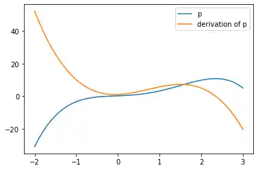
p = Polynomial(-0.8, 2.3, 0.5, 1, 0.2)
p_der = p.derivative()
fig, ax = plt.subplots()
X = np.linspace(-2, 3, 50, endpoint=True)
F = p(X)
F_derivative = p_der(X)
ax.plot(X, F)
ax.plot(X, F_derivative)
ax.legend(['p', 'derivation of p'])
OUTPUT:
<matplotlib.legend.Legend at 0x7f61931d03a0>
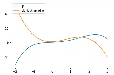
If we add a label to the plot function, the value will be used as the label in the legend command. There is anolther argument that we can add to the legend function: We can define the location of the legend inside of the axes plot with the parameter loc:
If we add a label to the plot function, the values will be used in the legend command:
from polynomials import Polynomial
import numpy as np
import matplotlib.pyplot as plt

p = Polynomial(-0.8, 2.3, 0.5, 1, 0.2)
p_der = p.derivative()

fig, ax = plt.subplots()
X = np.linspace(-2, 3, 50, endpoint=True)
F = p(X)
F_derivative = p_der(X)
ax.plot(X, F, label="p")
ax.plot(X, F_derivative, label="derivation of p")

ax.legend(loc='upper left')
OUTPUT:
<matplotlib.legend.Legend at 0x7f619313e220>
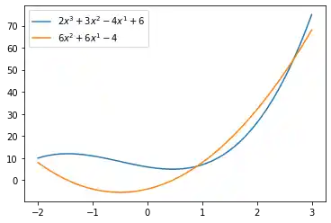
It might be even more interesting to see the actual function in mathematical notation in our legend. Our polynomial class is capable of printing the function in LaTeX notation.
print(p)
print(p_der)
OUTPUT:
-0.8x^4 + 2.3x^3 + 0.5x^2 + 1x^1 + 0.2
-3.2x^3 + 6.8999999999999995x^2 + 1.0x^1 + 1
We can also use LaTeX in our labels, if we include it in '$' signs.
from polynomials import Polynomial
import numpy as np
import matplotlib.pyplot as plt

p = Polynomial(2, 3, -4, 6)
p_der = p.derivative()

fig, ax = plt.subplots()
X = np.linspace(-2, 3, 50, endpoint=True)
F = p(X)
F_derivative = p_der(X)
ax.plot(X, F, label="$" + str(p) + "$")
ax.plot(X, F_derivative, label="$" + str(p_der) + "$")

ax.legend(loc='upper left')
OUTPUT:
<matplotlib.legend.Legend at 0x7f61930b47c0>
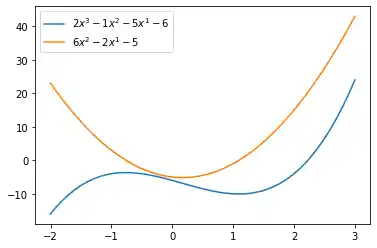
In many cases we don't know what the result may look like before you plot it. It could be for example, that the legend will overshadow an important part of the lines. If you don't know what the data may look like, it may be best to use 'best' as the argument for loc. Matplotlib will automatically try to find the best possible location for the legend:
from polynomials import Polynomial
import numpy as np
import matplotlib.pyplot as plt

p = Polynomial(2, -1, -5, -6)
p_der = p.derivative()
print(p_der)

fig, ax = plt.subplots()
X = np.linspace(-2, 3, 50, endpoint=True)
F = p(X)
F_derivative = p_der(X)
ax.plot(X, F, label="$" + str(p) + "$")
ax.plot(X, F_derivative, label="$" + str(p_der) + "$")

ax.legend(loc='best')
OUTPUT:
6x^2 - 2x^1 - 5
<matplotlib.legend.Legend at 0x7f6192f31730>
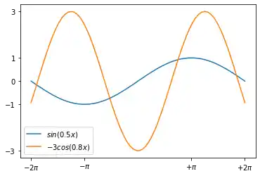
We will go back to trigonometric functions in the following examples. These examples show that
loc='best'can work pretty well:
import numpy as np
import matplotlib.pyplot as plt

X = np.linspace(-2 * np.pi, 2 * np.pi, 70, endpoint=True)
F1 = np.sin(0.5*X)
F2 = -3 * np.cos(0.8*X)

plt.xticks( [-6.28, -3.14, 3.14, 6.28],
        [r'$-2\pi$', r'$-\pi$', r'$+\pi$', r'$+2\pi$'])
plt.yticks([-3, -1, 0, +1, 3])
plt.plot(X, F1, label="$sin(0.5x)$")
plt.plot(X, F2, label="$-3 cos(0.8x)$")
plt.legend(loc='best')

plt.show()
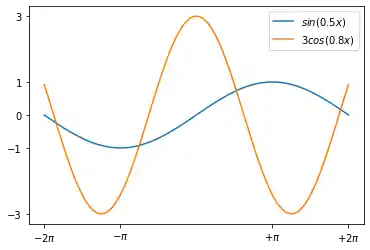
import numpy as np
import matplotlib.pyplot as plt

X = np.linspace(-2 * np.pi, 2 * np.pi, 70, endpoint=True)
F1 = np.sin(0.5*X)
F2 = 3 * np.cos(0.8*X)

plt.xticks( [-6.28, -3.14, 3.14, 6.28],
        [r'$-2\pi$', r'$-\pi$', r'$+\pi$', r'$+2\pi$'])
plt.yticks([-3, -1, 0, +1, 3])
plt.plot(X, F1, label="$sin(0.5x)$")
plt.plot(X, F2, label="$3 cos(0.8x)$")
plt.legend(loc='best')

plt.show()
Live Python training

Enjoying this page? We offer live Python training courses covering the content of this site.
See our Python training courses
Annotations
The visualizations of function plots often makes annotations necessary. This means we draw the readers attentions to important points and areas of the plot. To this purpose we use texts, labels and arrows. We have already used axis labels and titles for this purpose, but these are 'annotations' for the whole plot. We can easily annotate points inside the axis or on the graph with the annotate method of an axes object. In an annotation, there are two points to consider: the location being annotated represented by the argument xy and the location of the text xytext. Both of these arguments are (x,y) tuples.
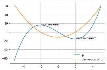
We demonstrate how easy it is in matplotlib to to annotate plots in matplotlib with the annotate method. We will annotate the local maximum and the local minimum of a function. In its simplest form annotate method needs two arguments annotate(s, xy), where s is the text string for the annotation and xx is the position of the point to be annotated:
from polynomials import Polynomial
import numpy as np
import matplotlib.pyplot as plt

p = Polynomial(1, 0, -12, 0)
p_der = p.derivative()

fig, ax = plt.subplots()
X = np.arange(-5, 5, 0.1)
F = p(X)

F_derivative = p_der(X)
ax.grid()

maximum = (-2, p(-2))
minimum = (2, p(2))
ax.annotate("local maximum", maximum)
ax.annotate("local minimum", minimum)

ax.plot(X, F, label="p")
ax.plot(X, F_derivative, label="derivation of p")

ax.legend(loc='best')
plt.show()
If you are not satisfied with the automatic positioning of the text, you can assign a tuple with a position for the text to the keyword parameter xytext:
from polynomials import Polynomial
import numpy as np
import matplotlib.pyplot as plt

p = Polynomial(1, 0, -12, 0)
p_der = p.derivative()

fig, ax = plt.subplots()
X = np.arange(-5, 5, 0.1)
F = p(X)

F_derivative = p_der(X)
ax.grid()

ax.annotate("local maximum",
            xy=(-2, p(-2)),
            xytext=(-1, p(-2)+35),
            arrowprops=dict(facecolor='orange'))
ax.annotate("local minimum",
            xy=(2, p(2)),
            xytext=(-2, p(2)-40),
            arrowprops=dict(facecolor='orange', shrink=0.05))
ax.annotate("inflection point",
            xy=(0, p(0)),
            xytext=(-3, -30),
            arrowprops=dict(facecolor='orange', shrink=0.05))


ax.plot(X, F, label="p")
ax.plot(X, F_derivative, label="derivation of p")

ax.legend(loc='best')
plt.show()
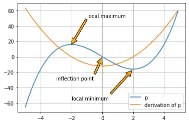
We have to provide some informations to the parameters of annotate, we have used in our previous example.
| Parameter | Meaning |
|---|---|
| xy | coordinates of the arrow tip |
| xytext | coordinates of the text location |
The xy and the xytext locations of our example are in data coordinates. There are other coordinate systems available we can choose. The coordinate system of xy and xytext can be specified string values assigned to xycoords and textcoords. The default value is 'data':
| String Value | Coordinate System |
|---|---|
| figure points | points from the lower left corner of the figure |
| figure pixels | pixels from the lower left corner of the figure |
| figure fraction | 0,0 is lower left of figure and 1,1 is upper right |
| axes points | points from lower left corner of axes |
| axes pixels | pixels from lower left corner of axes |
| axes fraction | 0,0 is lower left of axes and 1,1 is upper right |
| data | use the axes data coordinate system |
Additionally, we can also specify the properties of the arrow. To do so, we have to provide a dictionary of arrow properties to the parameter arrowprops:
| arrowprops key | description |
|---|---|
| width | the width of the arrow in points |
| headlength | The length of the arrow head in points |
| headwidth | the width of the base of the arrow head in points |
| shrink | move the tip and base some percent away from the annotated point and text |
| **kwargs | any key for matplotlib.patches.Polygon, e.g., facecolor |
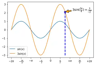
Of course, the sinus function has "boring" and interesting values. Let's assume that you are especially interested in the value of $3 * sin(3 * pi/4)$.
import numpy as np

print(3 * np.sin(3 * np.pi/4))
OUTPUT:
2.121320343559643
The numerical result doesn't look special, but if we do a symbolic calculation for the above expression we get $\frac{3}{\sqrt{2}}$. Now we want to label this point on the graph. We can do this with the annotate function. We want to annotate our graph with this point.
import numpy as np
import matplotlib.pyplot as plt
import matplotlib.ticker as ticker

X = np.linspace(-2 * np.pi, 2 * np.pi, 100)
F1 = np.sin(X)
F2 = 3 * np.sin(X)
fig, ax = plt.subplots()

positions = [np.pi / 2 * x for x in range(-4, 5)]
labels = [r'$-2\pi$', r'$-\frac{3\pi}{2}$', r'$-\pi$',
                    r'$-\frac{\pi}{2}$', 0, r'$\frac{\pi}{2}$',
                    r'$+\pi$', r'$\frac{3\pi}{2}$', r'$+2\pi$']
ax.xaxis.set_major_locator(ticker.FixedLocator(positions))
ax.xaxis.set_major_formatter(ticker.FixedFormatter(labels))


ax.plot(X, F1, label="$sin(x)$")
ax.plot(X, F2, label="$3 sin(x)$")
ax.legend(loc='lower left')
x = 3 * np.pi / 4

# Plot vertical line:
ax.plot([x, x],[-3, 3 * np.sin(x)], color ='blue', linewidth=2.5, linestyle="--")
# Print the blue dot:
ax.scatter([x,],[3 * np.sin(x),], 50, color ='blue')

text_x, text_y = (3.5, 2.2)
ax.annotate(r'$3\sin(\frac{3\pi}{4})=\frac{3}{\sqrt{2}}$',
            xy=(x, 3 * np.sin(x)),
            xytext=(text_x, text_y),
            arrowprops=dict(facecolor='orange', shrink=0.05),
            fontsize=12)

plt.show()
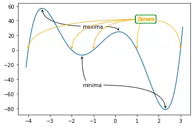
Some More Curve Sketching
There is anothe example, in which we play around with the arrows and annoate the extrema.
import numpy as np
import matplotlib.pyplot as plt

X = np.linspace(-4.1, 3.1, 150, endpoint=True)
F = X**5 + 3*X**4 - 11*X**3 - 27*X**2 + 10*X + 24

fig, ax = plt.subplots()
ax.plot(X, F)

minimum1 = -1.5264814, -7.051996717492152
minimum2 = 2.3123415793720303, -81.36889464201387
ax.annotate("minima",
            xy=minimum1,
            xytext=(-1.5, -50),
            arrowprops=dict(arrowstyle="->",
                            connectionstyle="angle3,angleA=0,angleB=-90"))
ax.annotate(" ",
            xy=minimum2,
            xytext=(-0.7, -50),
            arrowprops=dict(arrowstyle="->",
                            connectionstyle="angle3,angleA=0,angleB=-90"))

maximum1 = -3.35475845886632, 56.963107876630595
maximum2 = .16889828232847673,  24.868343482875485
ax.annotate("maxima", xy=maximum1,
            xytext=(-1.5, 30),
            arrowprops=dict(arrowstyle="->",
                       connectionstyle="angle3,angleA=0,angleB=-90"))
ax.annotate(" ", xy=maximum2,
            xytext=(-0.6, 30),
            arrowprops=dict(arrowstyle="->",
                      connectionstyle="angle3,angleA=0,angleB=-90"))

zeroes = -4, -2, -1, 1, 3
for zero in zeroes:
    zero = zero, 0
    ax.annotate("Zeroes",
                xy=zero,
                color="orange",
                bbox=dict(boxstyle="round", fc="none", ec="green"),
                xytext=(1, 40),
                arrowprops=dict(arrowstyle="->", color="orange",
                      connectionstyle="angle3,angleA=0,angleB=-90"))

plt.show()
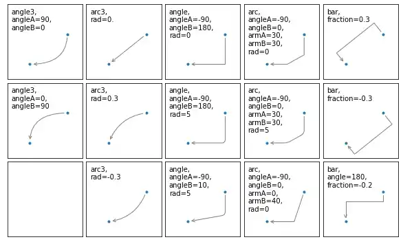
The following program visualizes the various arrowstyles:
import matplotlib.pyplot as plt


def demo_con_style(ax, connectionstyle):
    x1, y1 = 0.3, 0.2
    x2, y2 = 0.8, 0.6

    ax.plot([x1, x2], [y1, y2], ".")
    ax.annotate("",
                xy=(x1, y1), xycoords='data',
                xytext=(x2, y2), textcoords='data',
                arrowprops=dict(arrowstyle="->", color="0.5",
                                shrinkA=5, shrinkB=5,
                                patchA=None, patchB=None,
                                connectionstyle=connectionstyle))

    ax.text(.05, .95, connectionstyle.replace(",", ",\n"),
            transform=ax.transAxes, ha="left", va="top")


fig, axs = plt.subplots(3, 5, figsize=(8, 4.8))
demo_con_style(axs[0, 0], "angle3,angleA=90,angleB=0")
demo_con_style(axs[1, 0], "angle3,angleA=0,angleB=90")
demo_con_style(axs[0, 1], "arc3,rad=0.")
demo_con_style(axs[1, 1], "arc3,rad=0.3")
demo_con_style(axs[2, 1], "arc3,rad=-0.3")
demo_con_style(axs[0, 2], "angle,angleA=-90,angleB=180,rad=0")
demo_con_style(axs[1, 2], "angle,angleA=-90,angleB=180,rad=5")
demo_con_style(axs[2, 2], "angle,angleA=-90,angleB=10,rad=5")
demo_con_style(axs[0, 3], "arc,angleA=-90,angleB=0,armA=30,armB=30,rad=0")
demo_con_style(axs[1, 3], "arc,angleA=-90,angleB=0,armA=30,armB=30,rad=5")
demo_con_style(axs[2, 3], "arc,angleA=-90,angleB=0,armA=0,armB=40,rad=0")
demo_con_style(axs[0, 4], "bar,fraction=0.3")
demo_con_style(axs[1, 4], "bar,fraction=-0.3")
demo_con_style(axs[2, 4], "bar,angle=180,fraction=-0.2")

for ax in axs.flat:
    ax.set(xlim=(0, 1), ylim=(0, 1), xticks=[], yticks=[], aspect=1)
fig.tight_layout(pad=0.2)

plt.show()
Live Python training
Enjoying this page? We offer live Python training courses covering the content of this site.
Upcoming online Courses
See our Python training courses