6. Artificial Datasets with Scikit-Learn
By Bernd Klein. Last modified: 30 Mar 2024.
Generate Synthetical Data with Python

A problem with machine learning, especially when you are starting out and want to learn about the algorithms, is that it is often difficult to get suitable test data. Some cost a lot of money, others are not freely available because they are protected by copyright. Therefore, artificially generated test data can be a solution in some cases.
For this reason, this chapter of our tutorial deals with the artificial generation of data. This chapter is about creating artificial data. In the previous chapters of our tutorial we learned that Scikit-Learn (sklearn) contains different data sets. On the one hand, there are small toy data sets, but it also offers larger data sets that are often used in the machine learning community to test algorithms or also serve as a benchmark. It provides us with data coming from the 'real world'.
All this is great, but in many cases this is still not sufficient. Maybe you find the right kind of data, but you need more data of this kind or the data is not completely the kind of data you were looking for, e.g. maybe you need more complex or less complex data. This is the point where you should consider to create the data yourself. Here, sklearn offers help. It includes various random sample generators that can be used to create custom-made artificial datasets. Datasets that meet your ideas of size and complexity.
The following Python code is a simple example in which we create artificial weather data for some German cities. We use Pandas and Numpy to create the data:
import numpy as np
import pandas as pd


cities = ['Berlin', 'Frankfurt', 'Hamburg',
          'Nuremberg', 'Munich', 'Stuttgart',
          'Hanover', 'Saarbruecken', 'Cologne',
          'Constance', 'Freiburg', 'Karlsruhe'
         ]

n= len(cities)
data = {'Temperature': np.random.normal(24, 3, n),
        'Humidity': np.random.normal(78, 2.5, n),
        'Wind': np.random.normal(15, 4, n)
       }
df = pd.DataFrame(data=data, index=cities)
df
| Temperature | Humidity | Wind | |
|---|---|---|---|
| Berlin | 27.725953 | 80.861267 | 18.743561 |
| Frankfurt | 26.417917 | 76.026333 | 20.830202 |
| Hamburg | 21.313712 | 81.173045 | 3.641070 |
| Nuremberg | 22.543448 | 75.264739 | 12.235515 |
| Munich | 19.856540 | 79.426890 | 12.048967 |
| Stuttgart | 24.250901 | 78.102099 | 15.072345 |
| Hanover | 27.860119 | 77.117494 | 21.352655 |
| Saarbruecken | 22.475149 | 80.339778 | 10.960336 |
| Cologne | 21.809985 | 79.083956 | 8.800514 |
| Constance | 24.257502 | 79.191318 | 12.624630 |
| Freiburg | 20.329508 | 74.021469 | 12.114399 |
| Karlsruhe | 26.407603 | 80.530857 | 18.111030 |
Live Python training

Enjoying this page? We offer live Python training courses covering the content of this site.
See our Python training courses
Another Example
We will create artificial data for four nonexistent types of flowers. If the names remind you of programming languages and pizza, it will be no coincidence:
- Flos Pythonem
- Flos Java
- Flos Margarita
- Flos artificialis
The RGB avarage colors values are correspondingly:
- (255, 0, 0)
- (245, 107, 0)
- (206, 99, 1)
- (255, 254, 101)
The average diameter of the calyx is:
- 3.8
- 3.3
- 4.1
- 2.9
| Flos pythonem (254, 0, 0) | Flos Java (245, 107, 0) |
|---|---|
| Flos margarita (206, 99, 1) | Flos artificialis (255, 254, 101) |
import matplotlib.pyplot as plt
import numpy as np
import pandas as pd

from scipy.stats import truncnorm

def truncated_normal(mean=0, sd=1, low=0, upp=10):
    return truncnorm(
        (low - mean) / sd, (upp - mean) / sd, loc=mean, scale=sd)

def truncated_normal_floats(mean=0, sd=1, low=0, upp=10, num=100):
    res = truncated_normal(mean=mean, sd=sd, low=low, upp=upp)
    return res.rvs(num)

def truncated_normal_ints(mean=0, sd=1, low=0, upp=10, num=100):
    res = truncated_normal(mean=mean, sd=sd, low=low, upp=upp)
    return res.rvs(num).astype(np.uint8)

# number of items for each flower class:
number_of_items_per_class = [190, 205, 230, 170]
flowers = {}
# flos Pythonem:
number_of_items = number_of_items_per_class[0]
reds = truncated_normal_ints(mean=254, sd=18, low=235, upp=256,
                             num=number_of_items)
greens = truncated_normal_ints(mean=107, sd=11, low=88, upp=127,
                             num=number_of_items)
blues = truncated_normal_ints(mean=0, sd=15, low=0, upp=20,
                             num=number_of_items)
calyx_dia = truncated_normal_floats(3.8, 0.3, 3.4, 4.2,
                             num=number_of_items)
data = np.column_stack((reds, greens, blues, calyx_dia))
flowers["flos_pythonem"] = data

# flos Java:
number_of_items = number_of_items_per_class[1]
reds = truncated_normal_ints(mean=245, sd=17, low=226, upp=256,
                             num=number_of_items)
greens = truncated_normal_ints(mean=107, sd=11, low=88, upp=127,
                             num=number_of_items)
blues = truncated_normal_ints(mean=0, sd=10, low=0, upp=20,
                             num=number_of_items)
calyx_dia = truncated_normal_floats(3.3, 0.3, 3.0, 3.5,
                             num=number_of_items)
data = np.column_stack((reds, greens, blues, calyx_dia))
flowers["flos_java"] = data

# flos margarita:
number_of_items = number_of_items_per_class[2]
reds = truncated_normal_ints(mean=206, sd=17, low=175, upp=238,
                             num=number_of_items)
greens = truncated_normal_ints(mean=99, sd=14, low=80, upp=120,
                             num=number_of_items)
blues = truncated_normal_ints(mean=1, sd=5, low=0, upp=12,
                             num=number_of_items)
calyx_dia = truncated_normal_floats(4.1, 0.3, 3.8, 4.4,
                             num=number_of_items)
data = np.column_stack((reds, greens, blues, calyx_dia))
flowers["flos_margarita"] = data

# flos artificialis:
number_of_items = number_of_items_per_class[3]
reds = truncated_normal_ints(mean=255, sd=8, low=245, upp=255,
                             num=number_of_items)
greens = truncated_normal_ints(mean=254, sd=10, low=240, upp=255,
                             num=number_of_items)
blues = truncated_normal_ints(mean=101, sd=5, low=90, upp=112,
                             num=number_of_items)
calyx_dia = truncated_normal_floats(2.9, 0.4, 2.4, 3.5,
                             num=number_of_items)
data = np.column_stack((reds, greens, blues, calyx_dia))
flowers["flos_artificialis"] = data

data = np.concatenate((flowers["flos_pythonem"],
                       flowers["flos_java"],
                       flowers["flos_margarita"],
                       flowers["flos_artificialis"]),
                      axis=0)

# assigning the labels
target = np.zeros(sum(number_of_items_per_class)) # 4 flowers
previous_end = 0
for i in range(1, 5):
    num = number_of_items_per_class[i-1]
    beg = previous_end
    target[beg: beg + num] += i
    previous_end = beg + num

conc_data = np.concatenate((data, target.reshape(target.shape[0], 1)),
                           axis=1)

np.savetxt("data/strange_flowers.txt", conc_data, fmt="%2.2f",)
import matplotlib.pyplot as plt

target_names = list(flowers.keys())
feature_names = ['red', 'green', 'blue', 'calyx']
n = 4
fig, ax = plt.subplots(n, n, figsize=(16, 16))

colors = ['blue', 'red', 'green', 'yellow']

for x in range(n):
    for y in range(n):
        xname = feature_names[x]
        yname = feature_names[y]
        for color_ind in range(1, len(target_names)+1):
            ax[x, y].scatter(data[target==color_ind, x],
                             data[target==color_ind, y],
                             label=target_names[color_ind-1],
                             c=colors[color_ind-1])

        ax[x, y].set_xlabel(xname)
        ax[x, y].set_ylabel(yname)
        ax[x, y].legend(loc='upper left')


plt.show() # scatter of strange flowers data

Generate Synthetic Data with Scikit-Learn
It is a lot easier to use the possibilities of Scikit-Learn to create synthetic data.
The functionalities available in sklearn can be grouped into
- Generators for classifictation and clustering
- Generators for creating data for regression
- Generators for manifold learning
- Generators for decomposition
Generators for Classification and Clustering
We start with the the function make_blobs of sklearn.datasets to create 'blob' like data distributions. By setting the value of centers to n_classes, we determine the number of blobs, i.e. the clusters. n_samples corresponds to the total number of points equally divided among clusters. If random_state is not set, we will have random results every time we call the function. We pass an int to this parameter for reproducible output across multiple function calls.
import numpy as np
import matplotlib.pyplot as plt
from sklearn.datasets import make_blobs

n_classes = 4
data, labels = make_blobs(n_samples=1000,
                          centers=n_classes,
                          random_state=100)

labels[:7]
OUTPUT:
array([1, 3, 1, 3, 1, 3, 2])
We will visualize the previously created blob custers with matplotlib:
# some blobs
fig, ax = plt.subplots()

colours = ('green', 'orange', 'blue', "pink")
for label in range(n_classes):
    ax.scatter(x=data[labels==label, 0],
               y=data[labels==label, 1],
               c=colours[label],
               s=40,
               label=label)

ax.set(xlabel='X',
       ylabel='Y',
       title='Blobs Examples')


ax.legend(loc='upper right')
OUTPUT:
<matplotlib.legend.Legend at 0x7f3855d8bfd0>

The centers of the blobs were randomly chosen in the previous example. In the following example we set the centers of the blobs explicitly. We create a list with the center points and pass it to the parameter centers:
import numpy as np
import matplotlib.pyplot as plt
from sklearn.datasets import make_blobs

centers = [[2, 3], [4, 5], [7, 9]]
data, labels = make_blobs(n_samples=1000,
                          centers=np.array(centers),
                          random_state=1)

labels[:7]
OUTPUT:
array([0, 1, 1, 0, 2, 2, 2])
Let us have a look at the previously created blob clusters:
# some more blobs
fig, ax = plt.subplots()

colours = ('green', 'orange', 'blue')
for label in range(len(centers)):
    ax.scatter(x=data[labels==label, 0],
               y=data[labels==label, 1],
               c=colours[label],
               s=40,
               label=label)

ax.set(xlabel='X',
       ylabel='Y',
       title='Blobs Examples')


ax.legend(loc='upper right')
OUTPUT:
<matplotlib.legend.Legend at 0x7f3855d66e50>

Usually, you want to save your artificially created datasets in a file. For this purpose, we can use the function savetxt from numpy. Before we can do this we have to reaarange our data. Each row should contain both the data and the label:
import numpy as np

labels = labels.reshape((labels.shape[0],1))
all_data = np.concatenate((data, labels), axis=1)
all_data[:7]
OUTPUT:
array([[ 1.72415394,  4.22895559,  0.        ],
       [ 4.16466507,  5.77817418,  1.        ],
       [ 4.51441156,  4.98274913,  1.        ],
       [ 1.49102772,  2.83351405,  0.        ],
       [ 6.0386362 ,  7.57298437,  2.        ],
       [ 5.61044976,  9.83428321,  2.        ],
       [ 5.69202866, 10.47239631,  2.        ]])
For some people it might be complicated to understand the combination of reshape and concatenate. Therefore, you can see an extremely simple example in the following code:
import numpy as np

a = np.array( [[1, 2], [3, 4]])
b = np.array( [5, 6])
b = b.reshape((b.shape[0], 1))
print(b)

x = np.concatenate( (a, b), axis=1)
x
OUTPUT:
[[5]
 [6]]
array([[1, 2, 5],
       [3, 4, 6]])
We use the numpy function savetxt to save the data. Don't worry about the strange name, it is just for fun and for reasons which will be clear soon:
np.savetxt("squirrels.txt",
           all_data,
           fmt=['%.3f', '%.3f', '%1d'])
all_data[:10]
OUTPUT:
array([[ 1.72415394,  4.22895559,  0.        ],
       [ 4.16466507,  5.77817418,  1.        ],
       [ 4.51441156,  4.98274913,  1.        ],
       [ 1.49102772,  2.83351405,  0.        ],
       [ 6.0386362 ,  7.57298437,  2.        ],
       [ 5.61044976,  9.83428321,  2.        ],
       [ 5.69202866, 10.47239631,  2.        ],
       [ 6.14017298,  8.56209179,  2.        ],
       [ 2.97620068,  5.56776474,  1.        ],
       [ 8.27980017,  8.54824406,  2.        ]])
Reading the data and conversion back into 'data' and 'labels'
We will demonstrate now, how to read in the data again and how to split it into data and labels again:
file_data = np.loadtxt("squirrels.txt")

data = file_data[:,:-1]
labels = file_data[:,-1]

#labels = labels.reshape((labels.shape[0]))
We had called the data file squirrels.txt, because we imagined a strange kind of animal living in the Sahara desert. The x-values stand for the night vision capabilities of the animals and the y-values correspond to the colour of the fur, going from sandish to black. We have three kinds of squirrels, 0, 1, and 2. (Be aware that our squirrals are imaginary squirrels and have nothing to do with the real squirrels of the Sahara!)
# sahara squirrel dataset graph
import matplotlib.pyplot as plt

colours = ('green', 'red', 'blue', 'magenta', 'yellow', 'cyan')
n_classes = 3

fig, ax = plt.subplots()
for n_class in range(0, n_classes):
    ax.scatter(data[labels==n_class, 0], data[labels==n_class, 1],
               c=colours[n_class], s=10, label=str(n_class))

ax.set(xlabel='Night Vision',
       ylabel='Fur color from sandish to black, 0 to 10 ',
       title='Sahara Virtual Squirrel')


ax.legend(loc='upper right')
OUTPUT:
<matplotlib.legend.Legend at 0x7f3855cf9130>

We will train our articifical data in the following code:
from sklearn.model_selection import train_test_split

data_sets = train_test_split(data,
                       labels,
                       train_size=0.8,
                       test_size=0.2,
                       random_state=42 # garantees same output for every run
                      )

train_data, test_data, train_labels, test_labels = data_sets
Other Interesting Distributions
import numpy as np


import sklearn.datasets as ds
data, labels = ds.make_moons(n_samples=150,
                             shuffle=True,
                             noise=0.19,
                             random_state=None)

data += np.array(-np.ndarray.min(data[:,0]),
                 -np.ndarray.min(data[:,1]))

np.ndarray.min(data[:,0]), np.ndarray.min(data[:,1])
OUTPUT:
(0.0, 0.8397536185996841)
# moon graphs
import matplotlib.pyplot as plt
fig, ax = plt.subplots()

ax.scatter(data[labels==0, 0], data[labels==0, 1],
               c='orange', s=40, label='oranges')
ax.scatter(data[labels==1, 0], data[labels==1, 1],
               c='blue', s=40, label='blues')

ax.set(xlabel='X',
       ylabel='Y',
       title='Moons')


#ax.legend(loc='upper right');
OUTPUT:
[Text(0.5, 0, 'X'), Text(0, 0.5, 'Y'), Text(0.5, 1.0, 'Moons')]

We want to scale values that are in a range [min, max] in a range [a, b].
We now use this formula to transform both the X and Y coordinates of data into other ranges:
min_x_new, max_x_new = 33, 88
min_y_new, max_y_new = 12, 20

data, labels = ds.make_moons(n_samples=100,
                             shuffle=True,
                             noise=0.05,
                             random_state=None)

min_x, min_y = np.ndarray.min(data[:,0]), np.ndarray.min(data[:,1])
max_x, max_y = np.ndarray.max(data[:,0]), np.ndarray.max(data[:,1])

#data -= np.array([min_x, 0])
#data *= np.array([(max_x_new - min_x_new) / (max_x - min_x), 1])
#data += np.array([min_x_new, 0])

#data -= np.array([0, min_y])
#data *= np.array([1, (max_y_new - min_y_new) / (max_y - min_y)])
#data += np.array([0, min_y_new])


data -= np.array([min_x, min_y])
data *= np.array([(max_x_new - min_x_new) / (max_x - min_x), (max_y_new - min_y_new) / (max_y - min_y)])
data += np.array([min_x_new, min_y_new])


#np.ndarray.min(data[:,0]), np.ndarray.max(data[:,0])
data[:6]
OUTPUT:
array([[53.07099336, 15.90410956],
       [55.21647263, 19.34394191],
       [45.75636593, 19.54503076],
       [34.24651697, 14.76831821],
       [86.07862392, 16.51836655],
       [76.39415741, 12.73351101]])
def scale_data(data, new_limits, inplace=False ):
    if not inplace:
        data = data.copy()
    min_x, min_y = np.ndarray.min(data[:,0]), np.ndarray.min(data[:,1])
    max_x, max_y = np.ndarray.max(data[:,0]), np.ndarray.max(data[:,1])
    min_x_new, max_x_new = new_limits[0]
    min_y_new, max_y_new = new_limits[1]
    data -= np.array([min_x, min_y])
    data *= np.array([(max_x_new - min_x_new) / (max_x - min_x), (max_y_new - min_y_new) / (max_y - min_y)])
    data += np.array([min_x_new, min_y_new])
    if inplace:
        return None
    else:
        return data


data, labels = ds.make_moons(n_samples=100,
                             shuffle=True,
                             noise=0.05,
                             random_state=None)

scale_data(data, [(1, 4), (3, 8)], inplace=True)
data[:10]
OUTPUT:
array([[3.39057004, 3.66886442],
       [2.85764807, 5.69178552],
       [1.74187254, 7.69735938],
       [2.28205797, 4.45884219],
       [2.3737917 , 7.67001322],
       [2.07535734, 4.73062139],
       [2.98442234, 4.98907794],
       [2.90376839, 5.79475827],
       [3.87626907, 5.46100223],
       [2.95439099, 6.25897644]])
# moon graph
fig, ax = plt.subplots()

ax.scatter(data[labels==0, 0], data[labels==0, 1],
               c='orange', s=40, label='oranges')
ax.scatter(data[labels==1, 0], data[labels==1, 1],
               c='blue', s=40, label='blues')

ax.set(xlabel='X',
       ylabel='Y',
       title='moons')


ax.legend(loc='upper right');

import sklearn.datasets as ds
data, labels = ds.make_circles(n_samples=100,
                             shuffle=True,
                             noise=0.05,
                             random_state=None)
fig, ax = plt.subplots()

ax.scatter(data[labels==0, 0], data[labels==0, 1],
               c='orange', s=40, label='oranges')
ax.scatter(data[labels==1, 0], data[labels==1, 1],
               c='blue', s=40, label='blues')

ax.set(xlabel='X',
       ylabel='Y',
       title='circles')


ax.legend(loc='upper right')
OUTPUT:
<matplotlib.legend.Legend at 0x7fd5a1dc7220>

'make_classification'
make_classification is a function provided by scikit-learn that generates a random classification dataset with specified characteristics. It's commonly used for creating synthetic datasets for testing machine learning algorithms and for educational purposes. Here's an explanation of its parameters:
-
n_samples: This parameter specifies the number of samples in the dataset. Each sample represents an observation or data point. For example, if
n_samples=1000, the dataset will contain 1000 data points. -
n_features: This parameter determines the number of features (or input variables) in each sample. Each feature represents a characteristic or attribute of the data point. For instance, if
n_features=2, each data point will have two features. -
n_classes: This parameter specifies the number of classes in the classification problem. Each sample in the dataset will be assigned one of these classes. For binary classification,
n_classesis typically set to 2. -
n_clusters_per_class: This parameter determines the number of clusters per class. It controls how well-separated the classes are in feature space. By default, each class is generated around a single centroid.
-
weights: This parameter allows you to specify the relative importance of each class in the dataset. For instance, you can assign higher weights to certain classes to make them appear more frequently in the dataset.
-
random_state: This parameter sets the seed for the random number generator, ensuring reproducibility. By fixing the random seed, you can obtain the same dataset every time you run the function with the same parameters.
-
class_sep: This parameter controls the separation between classes in feature space. Higher values result in more distinct classes, while lower values lead to more overlap between classes.
-
shuffle: This parameter determines whether to shuffle the samples randomly. If set to True (default), the order of samples in the dataset will be randomized.
-
flip_y: This parameter controls the percentage of labels that are randomly flipped to introduce noise into the dataset. It's useful for simulating imperfect labeling in real-world scenarios.
Overall, make_classification is a versatile function for generating synthetic classification datasets with various characteristics, allowing users to tailor the dataset to their specific needs for experimentation and evaluation of machine learning models.
We show a simple example:
import numpy as np
import matplotlib.pyplot as plt
from sklearn.datasets import make_classification

# Generate a random binary classification dataset
X, y = make_classification(n_samples=100, n_features=2, n_classes=2,
                           n_clusters_per_class=1, n_informative=2,
                           n_redundant=0, n_repeated=0, random_state=42)
# Plot the dataset
plt.figure(figsize=(8, 6))
plt.scatter(X[y == 0][:, 0], X[y == 0][:, 1], color='blue', label='Class 0')
plt.scatter(X[y == 1][:, 0], X[y == 1][:, 1], color='red', label='Class 1')
plt.title('Binary Classification Dataset')
plt.xlabel('Feature 1')
plt.ylabel('Feature 2')
plt.legend()
plt.grid(True)
plt.show()

import numpy as np
import matplotlib.pyplot as plt
from sklearn.datasets import make_classification

# Generate a random binary classification dataset
X, y = make_classification(n_samples=200, n_features=2, n_classes=2,
                            n_clusters_per_class=1, n_informative=2,
                            n_redundant=0, n_repeated=0, random_state=42)

# Plot the dataset
plt.figure(figsize=(8, 6))
plt.scatter(X[y == 0][:, 0], X[y == 0][:, 1], color='blue', label='Class 0')
plt.scatter(X[y == 1][:, 0], X[y == 1][:, 1], color='red', label='Class 1')
plt.title('Binary Classification Dataset')
plt.xlabel('Feature 1')
plt.ylabel('Feature 2')
plt.legend()
plt.grid(True)

Another Example with Three Features
import numpy as np
import matplotlib.pyplot as plt
from sklearn.datasets import make_classification

# Generate a random binary classification dataset with three features
X, y = make_classification(n_samples=200, n_features=3, n_classes=2,
                            n_clusters_per_class=1, n_informative=3,
                            n_redundant=0, n_repeated=0, random_state=42)

# Plot the dataset
fig = plt.figure(figsize=(10, 7))
ax = fig.add_subplot(111, projection='3d')

# Scatter plot for Class 0
ax.scatter(X[y == 0][:, 0], X[y == 0][:, 1], X[y == 0][:, 2], color='blue', label='Class 0')

# Scatter plot for Class 1
ax.scatter(X[y == 1][:, 0], X[y == 1][:, 1], X[y == 1][:, 2], color='red', label='Class 1')

ax.set_title('Binary Classification Dataset with Three Features')
ax.set_xlabel('Feature 1')
ax.set_ylabel('Feature 2')
ax.set_zlabel('Feature 3')
ax.legend()
OUTPUT:
<matplotlib.legend.Legend at 0x7fe405c2ac90>

Further usage of make_classification
The following code generates and visualizes various synthetic datasets, each with distinct characteristics. These datasets serve as useful tools for understanding different classification scenarios and assessing the performance of classification algorithms. Let's dive into the generated datasets and examine their features and distributions.
print(__doc__)

import matplotlib.pyplot as plt

from sklearn.datasets import make_classification
from sklearn.datasets import make_blobs
from sklearn.datasets import make_gaussian_quantiles

plt.figure(figsize=(8, 8))
plt.subplots_adjust(bottom=.05, top=.9, left=.05, right=.95)

plt.subplot(321)
plt.title("One informative feature, one cluster per class", fontsize='small')
X1, Y1 = make_classification(n_features=2, n_redundant=0, n_informative=1,
                             n_clusters_per_class=1)
plt.scatter(X1[:, 0], X1[:, 1], marker='o', c=Y1,
            s=25, edgecolor='k')

plt.subplot(322)
plt.title("Two informative features, one cluster per class", fontsize='small')
X1, Y1 = make_classification(n_features=2, n_redundant=0, n_informative=2,
                             n_clusters_per_class=1)
plt.scatter(X1[:, 0], X1[:, 1], marker='o', c=Y1,
            s=25, edgecolor='k')

plt.subplot(323)
plt.title("Two informative features, two clusters per class",
          fontsize='small')
X2, Y2 = make_classification(n_features=2,
                             n_redundant=0,
                             n_informative=2)
plt.scatter(X2[:, 0], X2[:, 1], marker='o', c=Y2,
            s=25, edgecolor='k')

plt.subplot(324)
plt.title("Multi-class, two informative features, one cluster",
          fontsize='small')
X1, Y1 = make_classification(n_features=2,
                             n_redundant=0,
                             n_informative=2,
                             n_clusters_per_class=1,
                             n_classes=3)
plt.scatter(X1[:, 0], X1[:, 1], marker='o', c=Y1,
            s=25, edgecolor='k')


plt.subplot(325)
plt.title("Gaussian divided into three quantiles", fontsize='small')
X1, Y1 = make_gaussian_quantiles(n_features=2, n_classes=3)
plt.scatter(X1[:, 0], X1[:, 1], marker='o', c=Y1,
            s=25, edgecolor='k')

plt.show()  # various graphs
OUTPUT:
Automatically created module for IPython interactive environment

Live Python training
Enjoying this page? We offer live Python training courses covering the content of this site.
Upcoming online Courses
See our Python training courses
Exercises
Exercise 1
Create two clusters which look similar to this one:
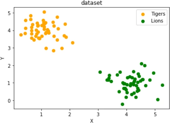
two testsets which are separable with a perceptron without a bias node.
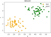
Exercise 2
Create two clusters similar to the following image:
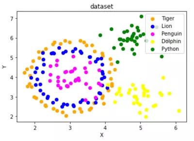
Exercise 3
Create a dataset with five classes "Tiger", "Lion", "Penguin", "Dolphin", and "Python". The sets should look similar to the following diagram:
Solutions
Solution to Exercise 1
# solution to exercise1 graph
data, labels = make_blobs(n_samples=100,
                            cluster_std = 0.5,
                            centers=[[1, 4] ,[4, 1]],
                            random_state=1)

fig, ax = plt.subplots()

colours = ["orange", "green"]
label_name = ["Tigers", "Lions"]
for label in range(0, 2):
    ax.scatter(data[labels==label, 0], data[labels==label, 1],
               c=colours[label], s=40, label=label_name[label])


ax.set(xlabel='X',
       ylabel='Y',
       title='dataset')


ax.legend(loc='upper right')
OUTPUT:
<matplotlib.legend.Legend at 0x7fd5a1b40370>

Solution to Exercise 2
# solution to exercise2 graph
data, labels = make_blobs(n_samples=100,
                            cluster_std = 0.5,
                            centers=[[2, 2] ,[4, 4]],
                            random_state=1)

fig, ax = plt.subplots()

colours = ["orange", "green"]
label_name = ["ham", "spam"]
for label in range(0, 2):
    ax.scatter(data[labels==label, 0], data[labels==label, 1],
               c=colours[label], s=40, label=label_name[label])


ax.set(xlabel='X',
       ylabel='Y',
       title='dataset')


ax.legend(loc='upper right')
OUTPUT:
<matplotlib.legend.Legend at 0x7fd5a1aad550>

Solution to Exercise 3
import sklearn.datasets as ds
data, labels = ds.make_circles(n_samples=100,
                               shuffle=True,
                               noise=0.05,
                               random_state=42)

centers = [[3, 4], [5, 3], [4.5, 6]]
data2, labels2 = make_blobs(n_samples=100,
                            cluster_std = 0.5,
                            centers=centers,
                            random_state=1)


#for i in range(len(centers)-1, -1, -1):
#    labels2[labels2==0+i] = i+2
labels2 += +2

print(labels2)
labels = np.concatenate([labels, labels2])
data = data * [1.2, 1.8] + [3, 4]

data = np.concatenate([data, data2], axis=0)
OUTPUT:
[2 4 4 3 4 4 3 3 2 4 4 2 4 4 3 4 2 4 4 4 4 2 2 4 4 3 2 2 3 2 2 3 2 3 3 3 3
 3 4 3 3 2 3 3 3 2 2 2 2 3 4 4 4 2 4 3 3 2 2 3 4 4 3 3 4 2 4 2 4 3 3 4 2 2
 3 4 4 2 3 2 3 3 4 2 2 2 2 3 2 4 2 2 3 3 4 4 2 2 4 3]
# solution graph
fig, ax = plt.subplots()

colours = ["orange", "blue", "magenta", "yellow", "green"]
label_name = ["Tiger", "Lion", "Penguin", "Dolphin", "Python"]
for label in range(0, len(centers)+2):
    ax.scatter(data[labels==label, 0], data[labels==label, 1],
               c=colours[label], s=40, label=label_name[label])


ax.set(xlabel='X',
       ylabel='Y',
       title='dataset')


ax.legend(loc='upper right')
OUTPUT:
<matplotlib.legend.Legend at 0x7fd5a1a61d00>

Live Python training
Enjoying this page? We offer live Python training courses covering the content of this site.
Upcoming online Courses
See our Python training courses