36. Data Visualization with Pandas
By Bernd Klein. Last modified: 03 Feb 2025.
Introduction

It is seldom a good idea to present your scientific or business data solely in rows and columns of numbers. We rather use various kinds of diagrams to visualize our data. This makes the communication of information more efficiently and easy to grasp. In other words, it makes complex data more accessible and understandable. The numerical data can be graphically encoded with line charts, bar charts, pie charts, histograms, scatterplots and others.
We have already seen the powerful capabilities of for creating publication-quality plots. Matplotlib is a low-level tool to achieve this goal, because you have to construe your plots by adding up basic components, like legends, tick labels, contours and so on. Pandas provides various plotting possibilities, which make like a lot easier.
We will start with an example for a line plot.
Live Python training

Enjoying this page? We offer live Python training courses covering the content of this site.
See our Python training courses
Line Plot in Pandas
Series
Both the Pandas Series and DataFrame objects support a plot method.
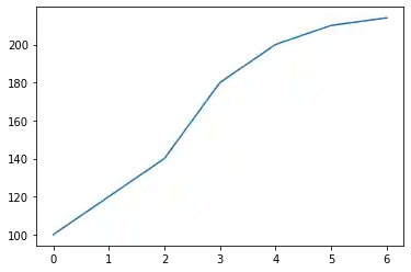
You can see a simple example of a line plot with for a Series object. We use a simple Python list "data" as the data for the range. The index will be used for the x values, or the domain.
import pandas as pd

data = [100, 120, 140, 180, 200, 210, 214]
s = pd.Series(data, index=range(len(data)))

s.plot()
OUTPUT:
<AxesSubplot:>

It is possible to suppress the usage of the index by setting the keyword parameter "use_index" to False. In our example this will give us the same result:
s.plot(use_index=False)
OUTPUT:
<AxesSubplot:>
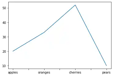
We will experiment now with a Series which has an index consisting of alphabetical values.
fruits = ['apples', 'oranges', 'cherries', 'pears']
quantities = [20, 33, 52, 10]
S = pd.Series(quantities, index=fruits)
S.plot()
OUTPUT:
<AxesSubplot:>
Line Plots in DataFrames
We will introduce now the plot method of a DataFrame. We define a dcitionary with the population and area figures. This dictionary can be used to create the DataFrame, which we want to use for plotting:
import pandas as pd

cities = {"name": ["London", "Berlin", "Madrid", "Rome",
                   "Paris", "Vienna", "Bucharest", "Hamburg",
                   "Budapest", "Warsaw", "Barcelona",
                   "Munich", "Milan"],
          "population": [8615246, 3562166, 3165235, 2874038,
                         2273305, 1805681, 1803425, 1760433,
                         1754000, 1740119, 1602386, 1493900,
                         1350680],
          "area" : [1572, 891.85, 605.77, 1285,
                    105.4, 414.6, 228, 755,
                    525.2, 517, 101.9, 310.4,
                    181.8]
}

city_frame = pd.DataFrame(cities,
                          columns=["population", "area"],
                          index=cities["name"])
print(city_frame)
OUTPUT:
           population     area
London        8615246  1572.00
Berlin        3562166   891.85
Madrid        3165235   605.77
Rome          2874038  1285.00
Paris         2273305   105.40
Vienna        1805681   414.60
Bucharest     1803425   228.00
Hamburg       1760433   755.00
Budapest      1754000   525.20
Warsaw        1740119   517.00
Barcelona     1602386   101.90
Munich        1493900   310.40
Milan         1350680   181.80
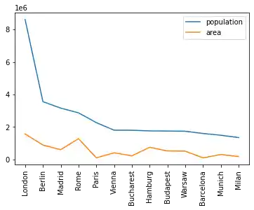
The following code plots our DataFrame city_frame. We will multiply the area column by 1000, because otherwise the "area" line would not be visible or in other words would be overlapping with the x axis:
city_frame["area"] *= 1000
city_frame.plot()
OUTPUT:
<AxesSubplot:>
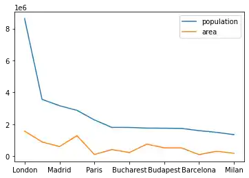
This plot is not coming up to our expectations, because not all the city names appear on the x axis. We can change this by defining the xticks explicitly with "range(len((city_frame.index))". Furthermore, we have to set use_index to True, so that we get city names and not numbers from 0 to len((city_frame.index):
city_frame.plot(xticks=range(len(city_frame.index)),
                use_index=True)
OUTPUT:
<AxesSubplot:>
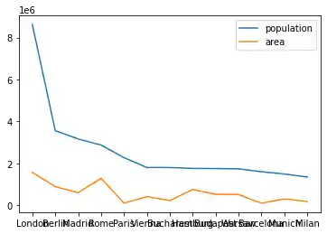
Now, we have a new problem. The city names are overlapping. There is remedy at hand for this problem as well. We can rotate the strings by 90 degrees. The names will be printed vertically afterwards:
city_frame.plot(xticks=range(len(city_frame.index)),
                use_index=True,
                rot=90)
OUTPUT:
<AxesSubplot:>
Using Twin Axes
We multiplied the area column by 1000 to get a proper output. Instead of this, we could have used twin axes. We will demonstrate this in the following example. We will recreate the city_frame DataFrame to get the original area column:
city_frame = pd.DataFrame(cities,
                          columns=["population", "area"],
                          index=cities["name"])
print(city_frame)
OUTPUT:
           population     area
London        8615246  1572.00
Berlin        3562166   891.85
Madrid        3165235   605.77
Rome          2874038  1285.00
Paris         2273305   105.40
Vienna        1805681   414.60
Bucharest     1803425   228.00
Hamburg       1760433   755.00
Budapest      1754000   525.20
Warsaw        1740119   517.00
Barcelona     1602386   101.90
Munich        1493900   310.40
Milan         1350680   181.80
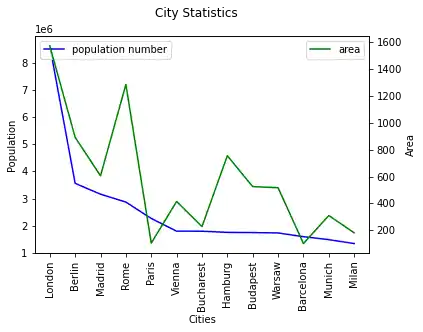
To get a twin axes represenation of our diagram, we need subplots from the module matplotlib and the function "twinx":
import matplotlib.pyplot as plt

fig, ax = plt.subplots()
fig.suptitle("City Statistics")
ax.set_ylabel("Population")
ax.set_xlabel("Cities")

ax2 = ax.twinx()
ax2.set_ylabel("Area")

city_frame["population"].plot(ax=ax,
                              style="b-",
                              xticks=range(len(city_frame.index)),
                              use_index=True,
                              rot=90)

city_frame["area"].plot(ax=ax2,
                        style="g-",
                        use_index=True,
                        rot=90)

ax.legend(["population number"], loc=2)
ax2.legend(loc=1)

plt.show()
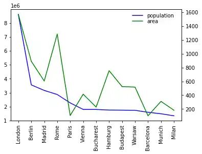
We can also create twin axis directly in Pandas without the aid of Matplotlib. We demonstrate this in the code of the following program:
import matplotlib.pyplot as plt

ax1= city_frame["population"].plot(style="b-",
                                   xticks=range(len(city_frame.index)),
                                   use_index=True,
                                   rot=90)
ax2 = ax1.twinx()

city_frame["area"].plot(ax=ax2,
                        style="g-",
                        use_index=True,
                        #secondary_y=True,
                        rot=90)


ax1.legend(loc = (.7,.9), frameon = False)
ax2.legend( loc = (.7, .85), frameon = False)

plt.show()
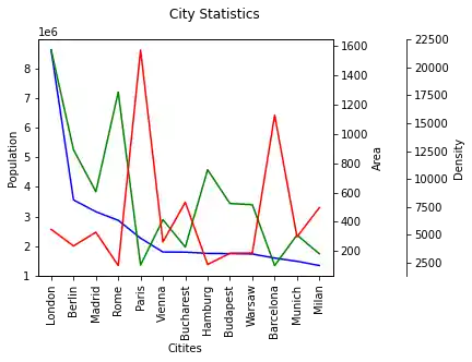
Multiple Y Axes
Let's add another axes to our city_frame. We will add a column with the population density, i.e. the number of people per square kilometre:
city_frame["density"] = city_frame["population"] / city_frame["area"]

city_frame
| population | area | density | |
|---|---|---|---|
| London | 8615246 | 1572.00 | 5480.436387 |
| Berlin | 3562166 | 891.85 | 3994.131300 |
| Madrid | 3165235 | 605.77 | 5225.143206 |
| Rome | 2874038 | 1285.00 | 2236.605447 |
| Paris | 2273305 | 105.40 | 21568.358634 |
| Vienna | 1805681 | 414.60 | 4355.236372 |
| Bucharest | 1803425 | 228.00 | 7909.758772 |
| Hamburg | 1760433 | 755.00 | 2331.699338 |
| Budapest | 1754000 | 525.20 | 3339.680122 |
| Warsaw | 1740119 | 517.00 | 3365.800774 |
| Barcelona | 1602386 | 101.90 | 15725.083415 |
| Munich | 1493900 | 310.40 | 4812.822165 |
| Milan | 1350680 | 181.80 | 7429.482948 |
Now we have three columns to plot. For this purpose, we will create three axes for our values:
import matplotlib.pyplot as plt

fig, ax = plt.subplots()
fig.suptitle("City Statistics")
ax.set_ylabel("Population")
ax.set_xlabel("Citites")

ax_area, ax_density = ax.twinx(), ax.twinx()
ax_area.set_ylabel("Area")
ax_density.set_ylabel("Density")

rspine = ax_density.spines['right']
rspine.set_position(('axes', 1.25))
ax_density.set_frame_on(True)
ax_density.patch.set_visible(False)
fig.subplots_adjust(right=0.75)

city_frame["population"].plot(ax=ax,
                              style="b-",
                              xticks=range(len(city_frame.index)),
                              use_index=True,
                              rot=90)

city_frame["area"].plot(ax=ax_area,
                        style="g-",
                        use_index=True,
                        rot=90)

city_frame["density"].plot(ax=ax_density,
                           style="r-",
                           use_index=True,
                           rot=90)

plt.show()
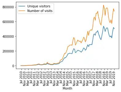
A More Complex Example
We use the previously gained knowledge in the following example. We use a file with visitor statistics from our website python-course.eu. The content of the file looks like this:
Month Year  "Unique visitors"   "Number of visits"  Pages   Hits    Bandwidth Unit
Jun 2010    11  13  42  290 2.63 MB
Jul 2010    27  39  232 939 9.42 MB
Aug 2010    75  87  207 1,096   17.37 MB
Sep 2010    171 221 480 2,373   39.63 MB

...

Apr 2018    434,346 663,327 1,143,762   7,723,268   377.56 GB
May 2018    402,390 619,993 1,124,517   7,307,779   394.72 GB
Jun 2018    369,739 573,102 1,034,335   6,773,820   386.60 GB
Jul 2018    352,670 552,519   967,778   6,551,347   375.86 GB
Aug 2018    407,512 642,542 1,223,319   7,829,987   472.37 GB
Sep 2018    463,937 703,327 1,187,224   8,468,723   514.46 GB
Oct 2018    537,343 826,290 1,403,176  10,013,025   620.55 GB
Nov 2018    514,072 781,335 1,295,594   9,487,834   642.16 GB
%matplotlib inline

import pandas as pd

data_path = "../data1/"
data = pd.read_csv(data_path + "python_course_monthly_history.txt",
                   quotechar='"',
                   thousands=",",
                   delimiter=r"\s+")

def unit_convert(x):
    value, unit = x
    if unit == "MB":
        value *= 1024
    elif unit == "GB":
        value *= 1048576 # i.e. 1024 **2
    return value

b_and_u= data[["Bandwidth", "Unit"]]
bandwidth = b_and_u.apply(unit_convert, axis=1)

del data["Unit"]
data["Bandwidth"] = bandwidth

month_year =  data[["Month", "Year"]]
month_year = month_year.apply(lambda x: x[0] + " " + str(x[1]),
                              axis=1)
data["Month"] = month_year
del data["Year"]

data.set_index("Month", inplace=True)
del data["Bandwidth"]

data[["Unique visitors", "Number of visits"]].plot(use_index=True,
                                                   rot=90,
                                                   xticks=range(1, len(data.index),4))
OUTPUT:
<AxesSubplot:xlabel='Month'>
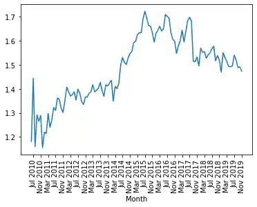
ratio = pd.Series(data["Number of visits"] / data["Unique visitors"],
                  index=data.index)
ratio.plot(use_index=True,
           xticks=range(1, len(ratio.index),4),
           rot=90)
OUTPUT:
<AxesSubplot:xlabel='Month'>
Converting String Columns to Floats
In the folder "data1", we have a file called
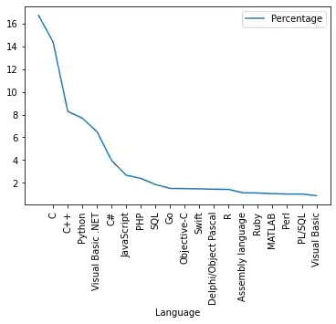
"tiobe_programming_language_usage_nov2018.txt"
with a ranking of programming languages by usage. The data has been collected and created by TIOBE in November 2018.
The file looks like this:
Position    "Language"  Percentage
1       Java    16.748%
2       C   14.396%
3       C++ 8.282%
4       Python  7.683%
5       "Visual Basic .NET" 6.490%
6       C#  3.952%
7       JavaScript  2.655%
8       PHP 2.376%
9       SQL 1.844%
The percentage column contains strings with a percentage sign. We can get rid of this when we read in the data with read_csv. All we have to do is define a converter function, which we to read_csv via the converters dictionary, which contains column names as keys and references to functions as values.
def strip_percentage_sign(x):
    return float(x.strip('%'))

data_path = "../data1/"
progs = pd.read_csv(data_path + "tiobe_programming_language_usage_nov2018.txt",
                   quotechar='"',
                   thousands=",",
                   index_col=1,
                   converters={'Percentage':strip_percentage_sign},
                   delimiter=r"\s+")

del progs["Position"]

print(progs.head(6))
OUTPUT:
                   Percentage
Language
Java                   16.748
C                      14.396
C++                     8.282
Python                  7.683
Visual Basic .NET       6.490
C#                      3.952
progs.plot(xticks=range(1, len(progs.index)),
           use_index=True, rot=90)
OUTPUT:
<AxesSubplot:xlabel='Language'>
Live Python training
Enjoying this page? We offer live Python training courses covering the content of this site.
Upcoming online Courses
See our Python training courses
Bar Plots in Pandas
To create bar plots with Pandas is as easy as plotting line plots. All we have to do is add the keyword parameter "kind" to the plot method and set it to "bar".
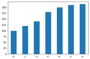
A Simple Example
import pandas as pd

data = [100, 120, 140, 180, 200, 210, 214]
s = pd.Series(data, index=range(len(data)))

s.plot(kind="bar")
OUTPUT:
<AxesSubplot:>
Bar Plot for Programming Language Usage
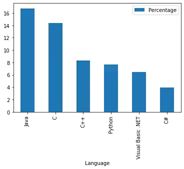
Let's get back to our programming language ranking. We will printout now a bar plot of the six most used programming languages:
progs[:6].plot(kind="bar")
OUTPUT:
<AxesSubplot:xlabel='Language'>
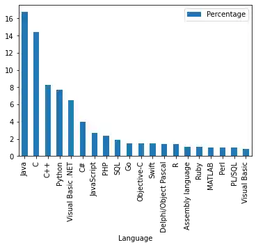
Now the whole chart with all programming languages:
progs.plot(kind="bar")
OUTPUT:
<AxesSubplot:xlabel='Language'>
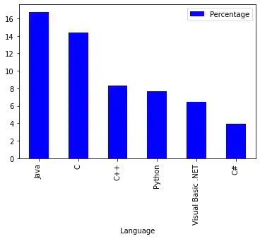
Colorize A Bar Plot
It is possible to colorize the bars indivually by assigning a list to the keyword parameter color:
my_colors = ['blue', 'red', 'c', 'y', 'g', 'm']
progs[:6].plot(kind="bar",
               color=my_colors)
OUTPUT:
<AxesSubplot:xlabel='Language'>
Pie Chart Diagrams in Pandas
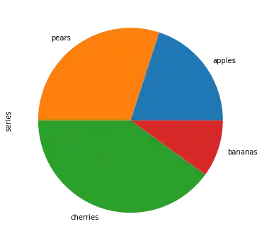
A simple example:
import pandas as pd

fruits = ['apples', 'pears', 'cherries', 'bananas']
series = pd.Series([20, 30, 40, 10],
                   index=fruits,
                   name='series')

series.plot.pie(figsize=(6, 6))
OUTPUT:
<AxesSubplot:ylabel='series'>
fruits = ['apples', 'pears', 'cherries', 'bananas']

series = pd.Series([20, 30, 40, 10],
                   index=fruits,
                   name='series')
explode = [0, 0.10, 0.40, 0.7]
series.plot.pie(figsize=(6, 6),
                explode=explode)
OUTPUT:
<AxesSubplot:ylabel='series'>

We will replot the previous bar plot as a pie chart plot:
import matplotlib.pyplot as plt

my_colors = ['b', 'r', 'c', 'y', 'g', 'm']
progs.plot.pie(subplots=True,
               legend=False)
OUTPUT:
array([<AxesSubplot:ylabel='Percentage'>], dtype=object)

It looks ugly that we see the y label "Percentage" inside our pie plot. We can remove it by calling "plt.ylabel('')"
import matplotlib.pyplot as plt

my_colors = ['b', 'r', 'c', 'y', 'g', 'm']
progs.plot.pie(subplots=True,
               legend=False)

plt.ylabel('')
OUTPUT:
Text(0, 0.5, '')

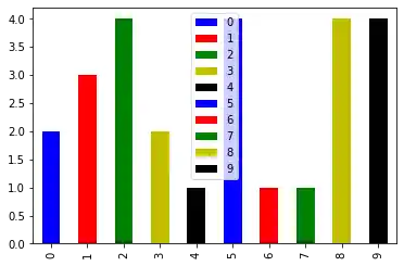
from matplotlib import pyplot as plt
from itertools import cycle, islice
import pandas, numpy as np  # I find np.random.randint to be better

# Make the data
x = [{i:np.random.randint(1,5)} for i in range(10)]
df = pandas.DataFrame(x)

# Make a list by cycling through the colors you care about
# to match the length of your data.
my_colors = list(islice(cycle(['b', 'r', 'g', 'y', 'k']), None, len(df)))

# Specify this list of colors as the `color` option to `plot`.
df.plot(kind='bar', stacked=True, color=my_colors)
OUTPUT:
<AxesSubplot:>
Live Python training
Enjoying this page? We offer live Python training courses covering the content of this site.
Upcoming online Courses
See our Python training courses